Merch Design/Branding Concepts
Daughter From Hell by Gracie Abrams
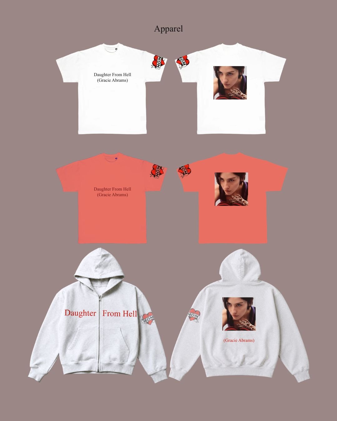
This conceptual merch collection for Gracie Abrams' album was an especially exciting project because it allowed me to build a cohesive world around the themes of the record. The album title, Daughter From Hell, centers on the complex relationship between a daughter and her mother, while the title track serves as an apology letter to her mom. The "MOM" tattoo featured throughout the collection is a visual interpretation of that sentiment, representing Gracie's love and appreciation for her mother through a permanent symbol of devotion.
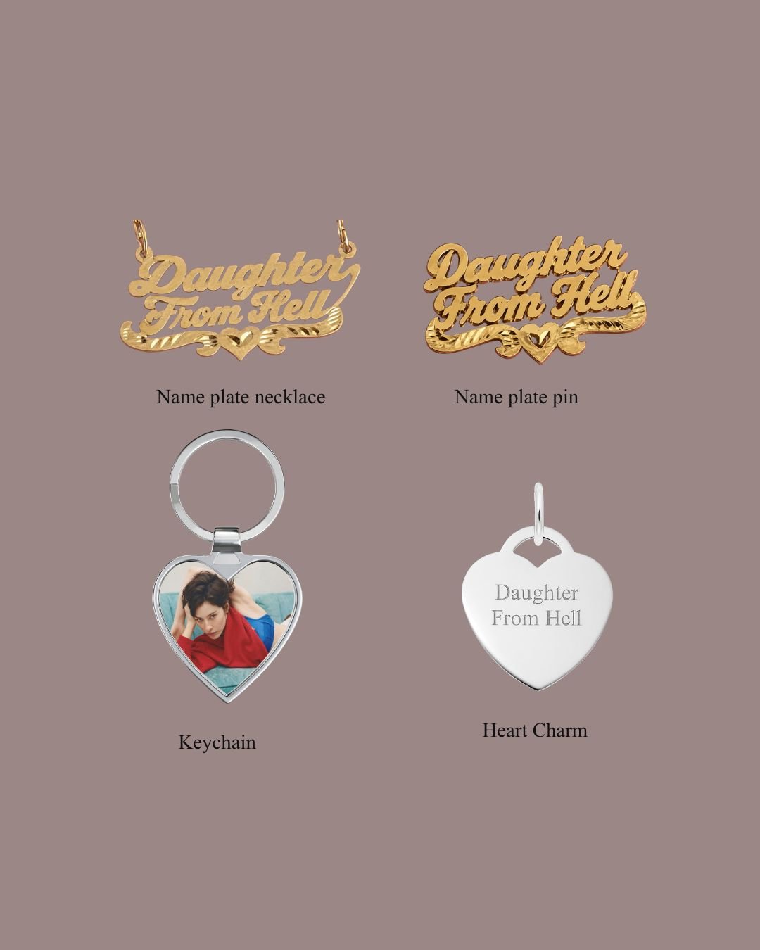
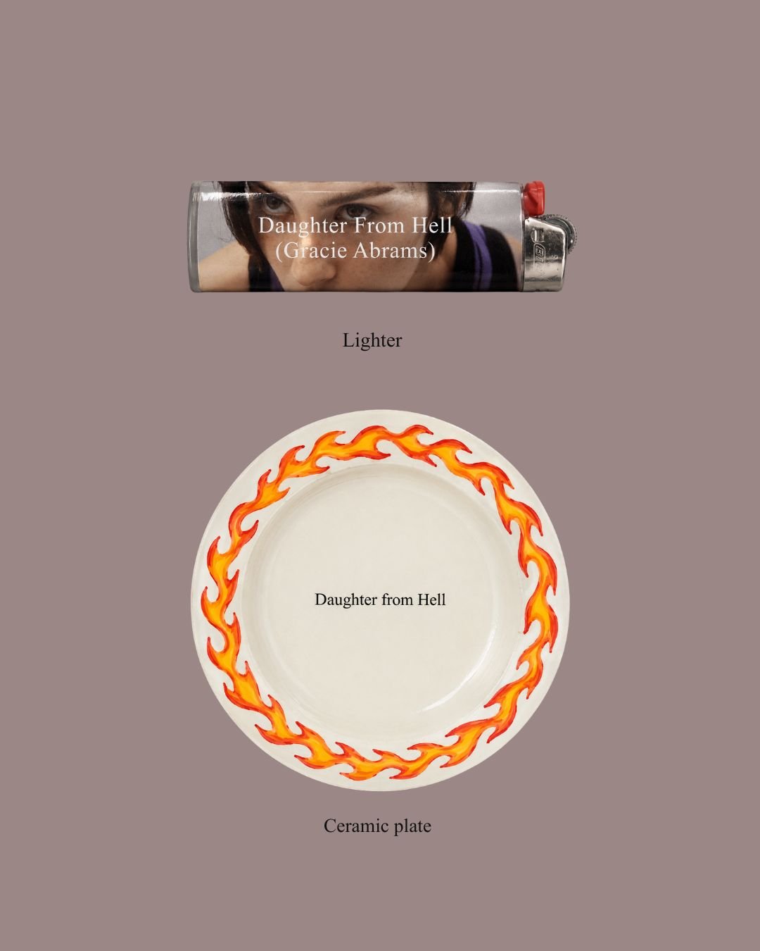
The collection extends beyond apparel to include a lighter, ceramic plate, keychains, a necklace, and a pin. When designing artist merchandise, I am most interested in creating pieces that feel genuinely wearable and functional rather than overtly promotional. My favorite merch is the kind that seamlessly fits into someone's everyday life. Pieces like the plate, necklace, and pin can be appreciated as beautiful objects on their own, while fans recognize the deeper connection to the album and the story behind them.
That philosophy is at the heart of how I approach merch design. I never want it to feel like someone is wearing a walking advertisement for an artist. Instead, I want each piece to become part of a person's daily life and personal style, serving as a subtle reminder of the music and the emotional connection they have with it.
Sex Hysteria by Jessie Murph
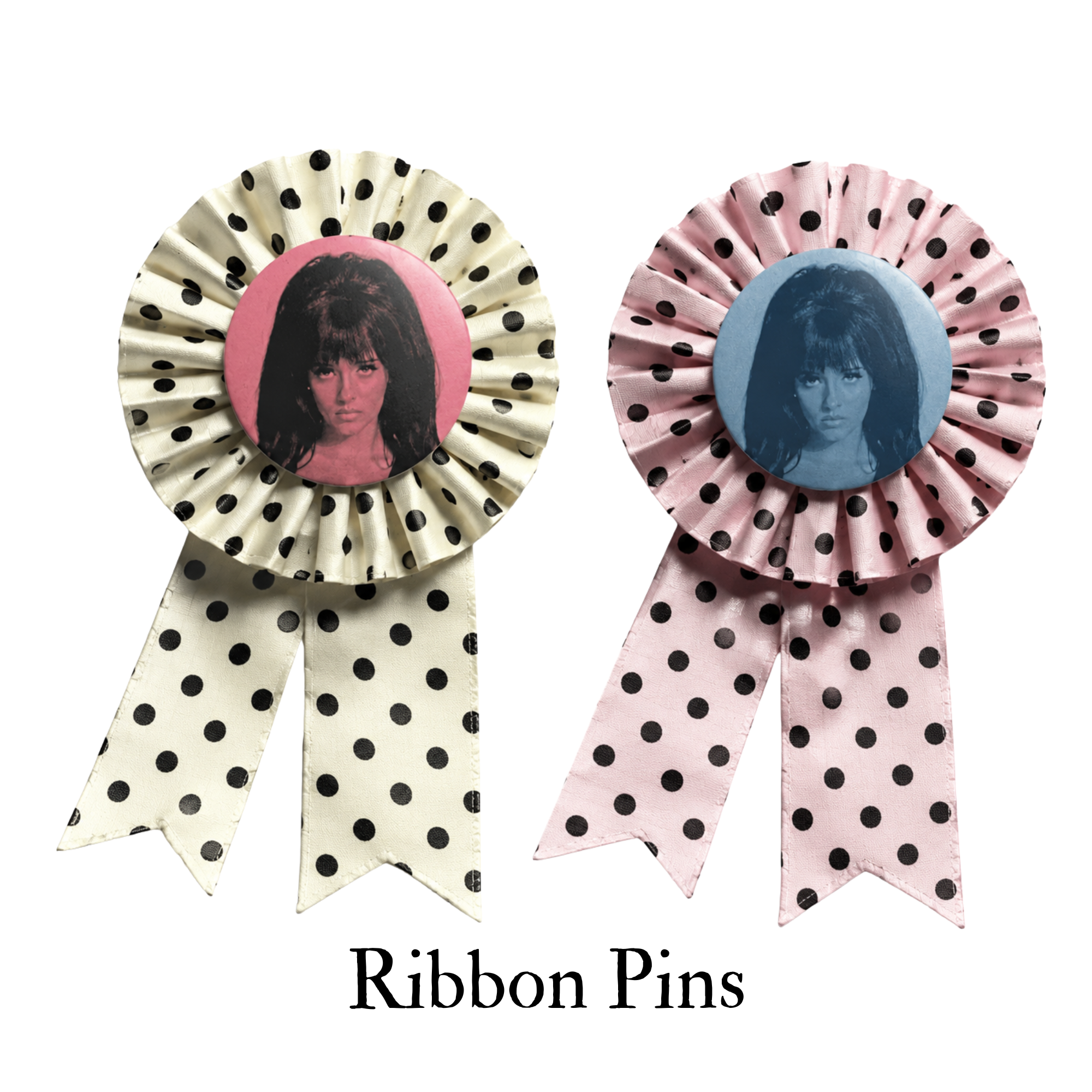
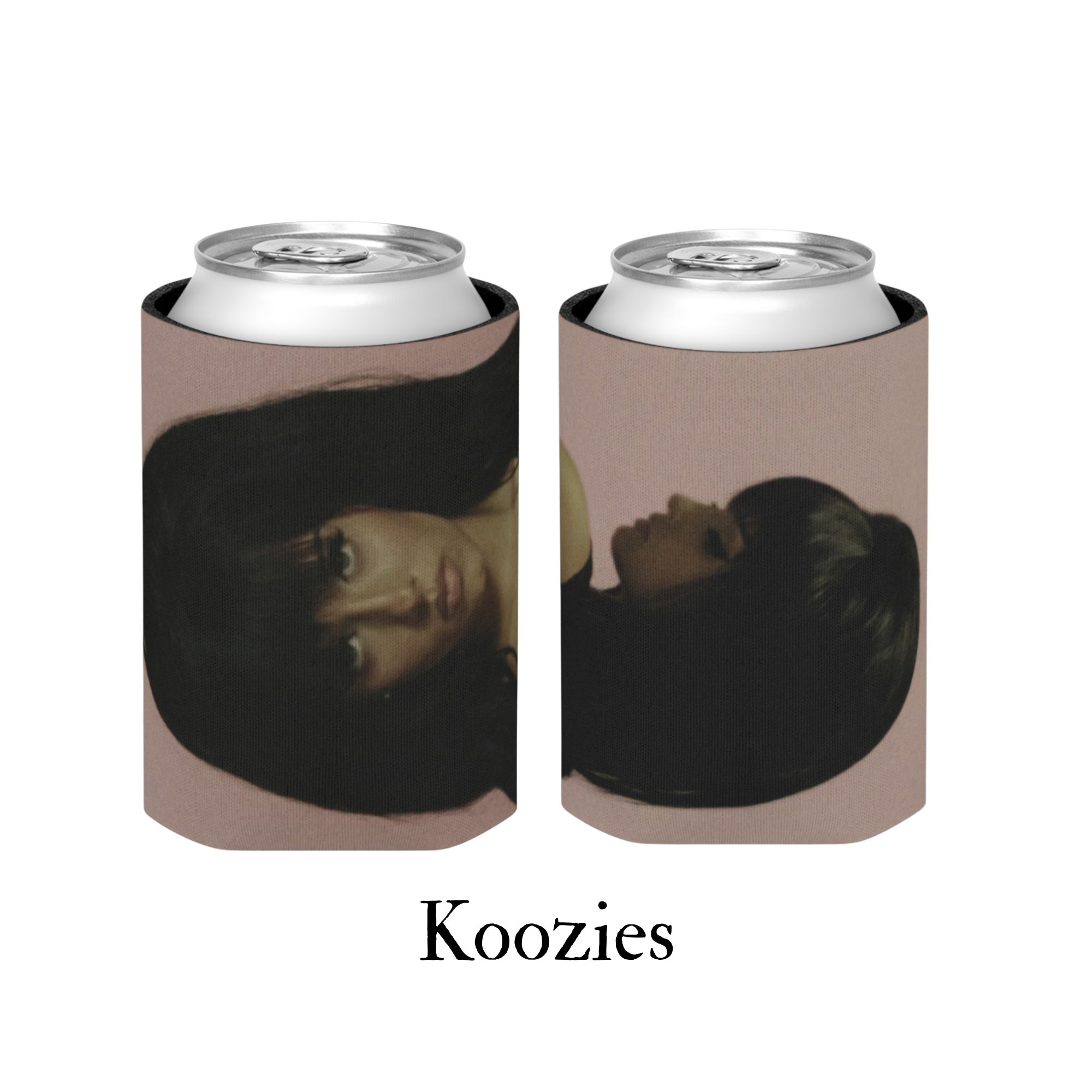
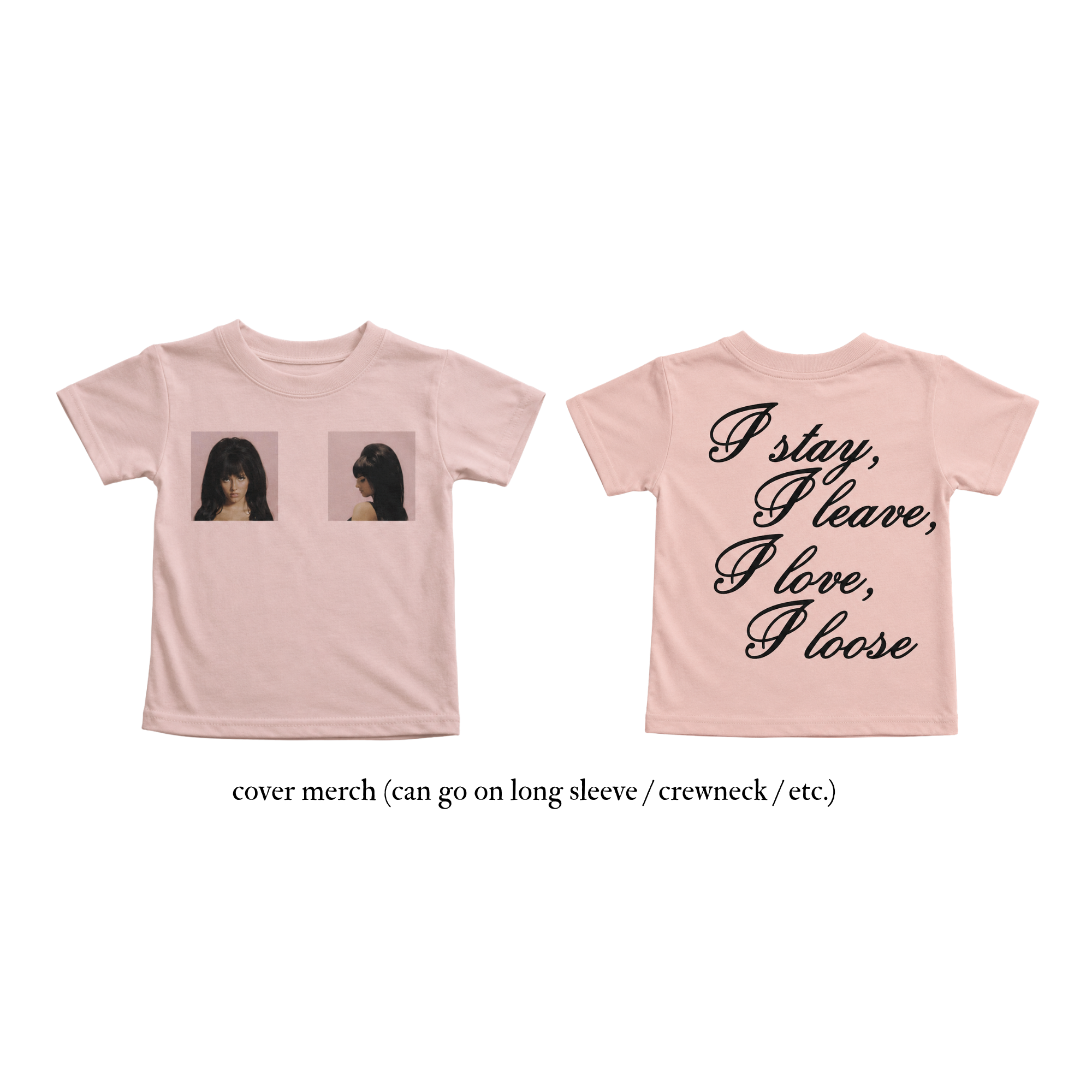
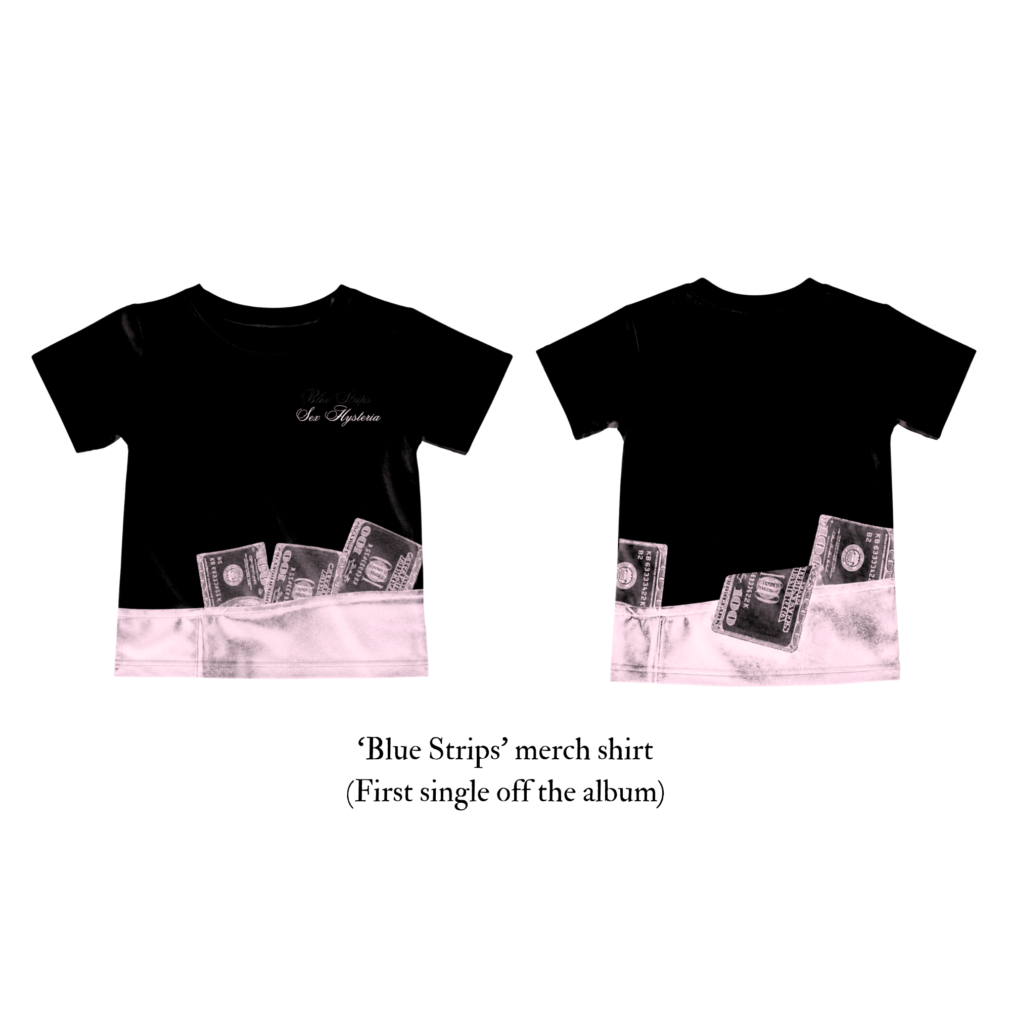
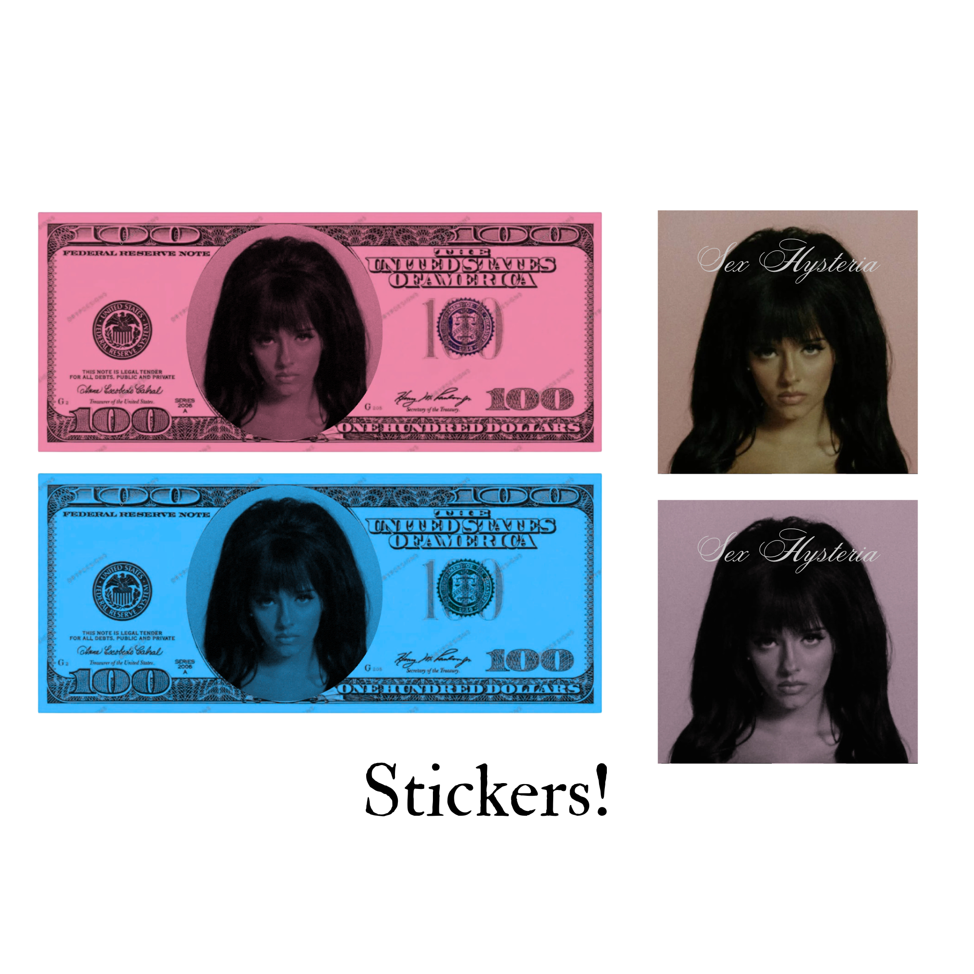
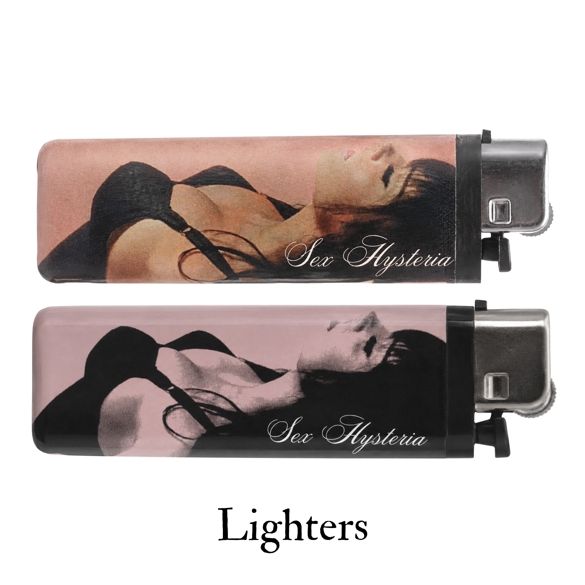
I loved that the album cover didn’t rely on typography to tell its story — the image alone carried the emotion. It felt raw, dark, and unapologetically direct. There’s also an old-Hollywood glamour to her presence that really resonates with my aesthetic. When designing the merch, I wanted to preserve that same energy: letting the visuals speak for themselves while capturing a balance of grit, nostalgia, and glamour.
“Brat Summer”
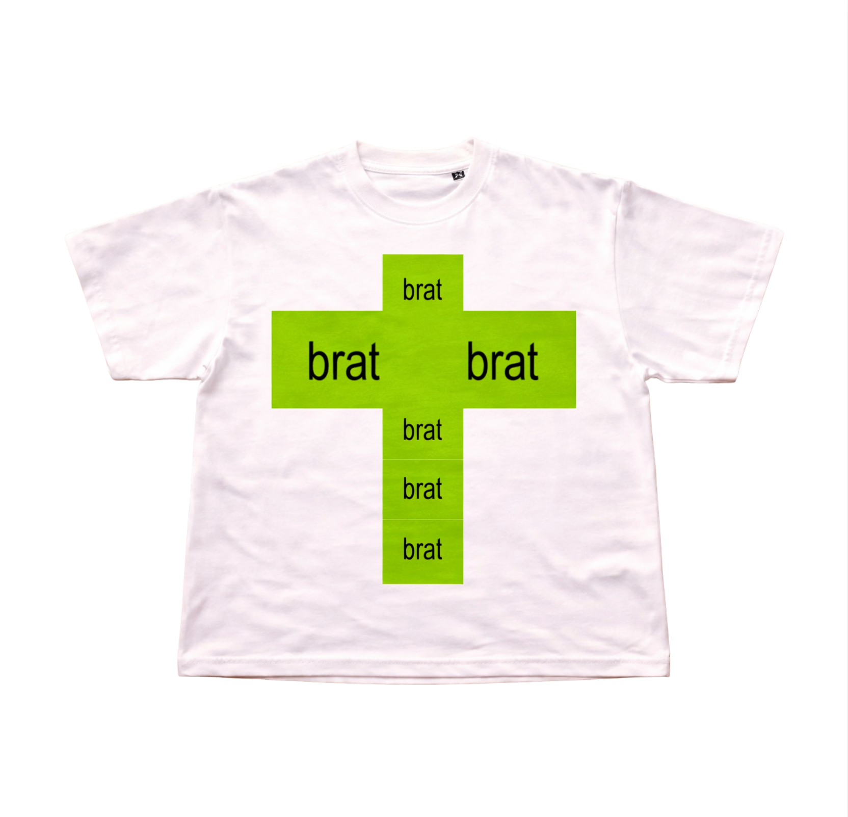
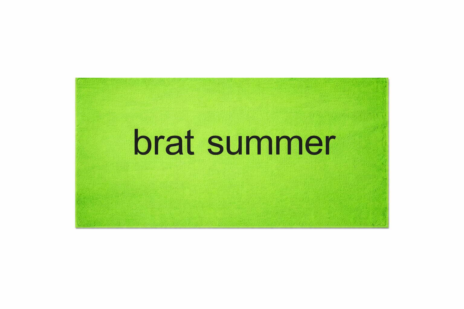
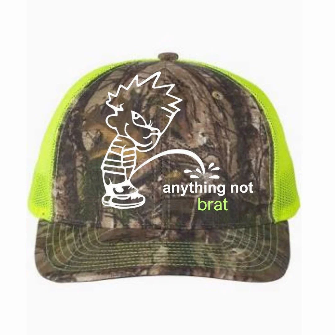
Brat Summer was such a defining moment in pop culture and became a huge source of inspiration for me. Sleazy, indie-pop energy from the 2000s came back in full force, and it felt like everyone collectively embraced the chaos, fun, and freedom that came with it. To me, Brat Summer represented the feeling of a cheap, touristy summer vacation — staying out too late, getting sunburnt, listening to loud music, making questionable decisions, and fully letting loose simply because it was summer and nothing else mattered. After years of restriction and isolation during the COVID era, there was something exciting about people romanticizing fun again.
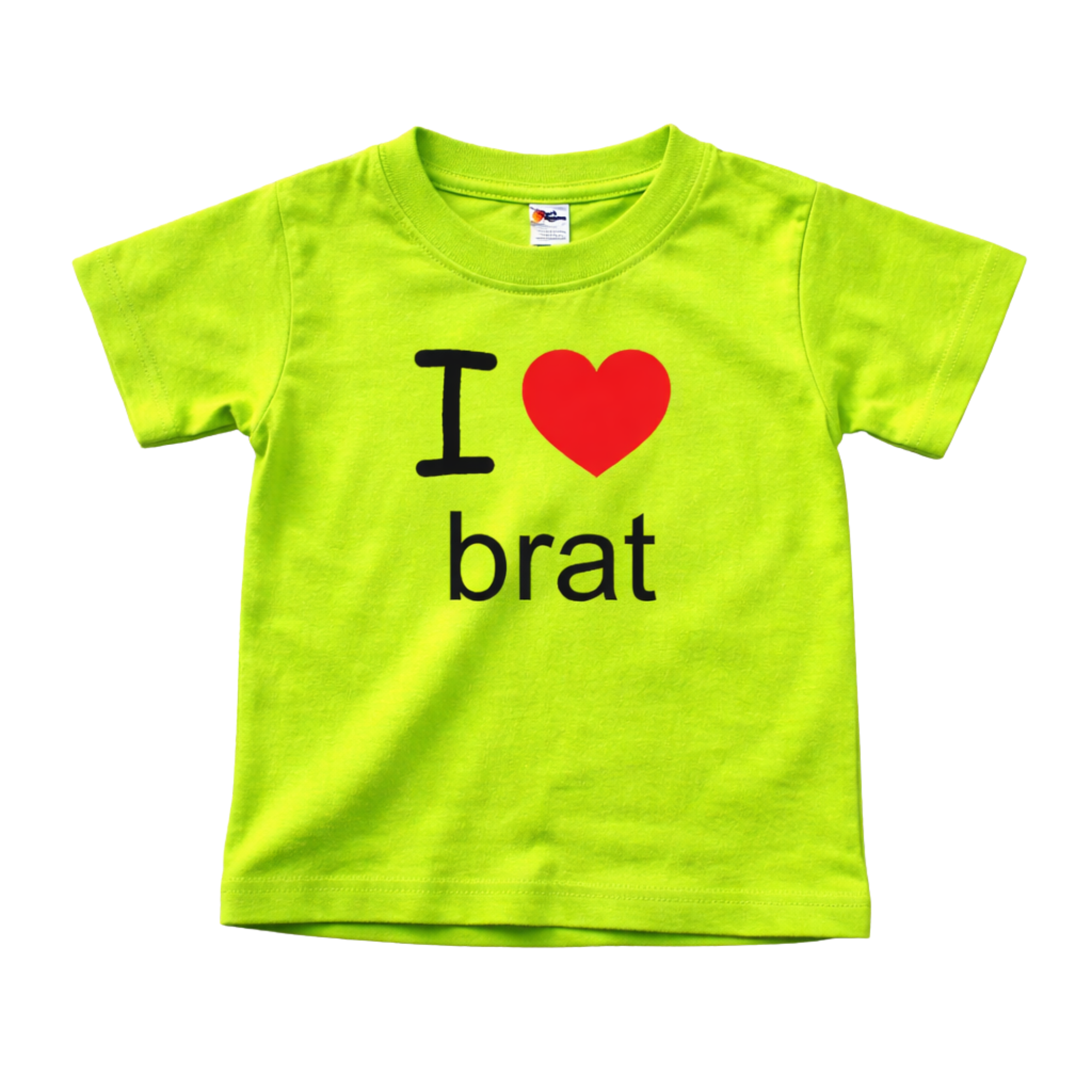
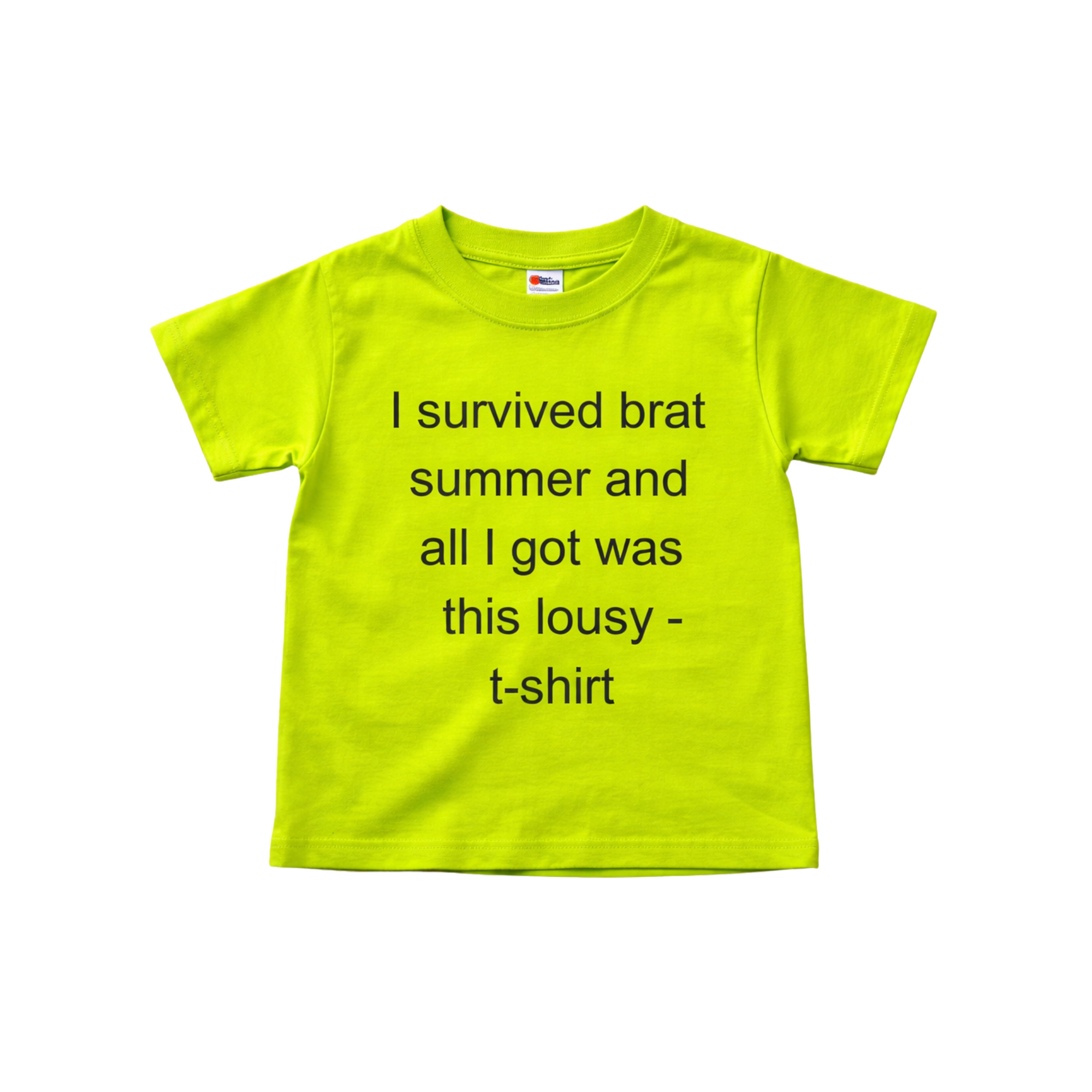
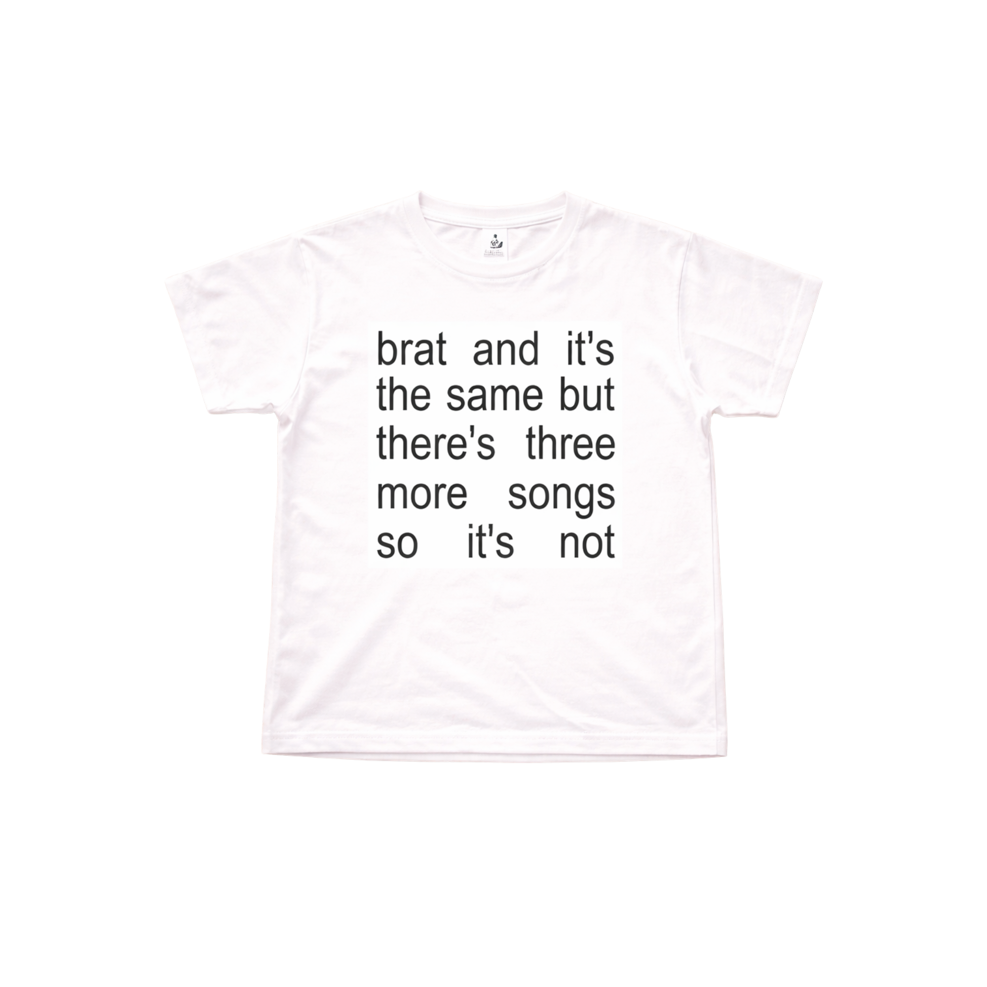
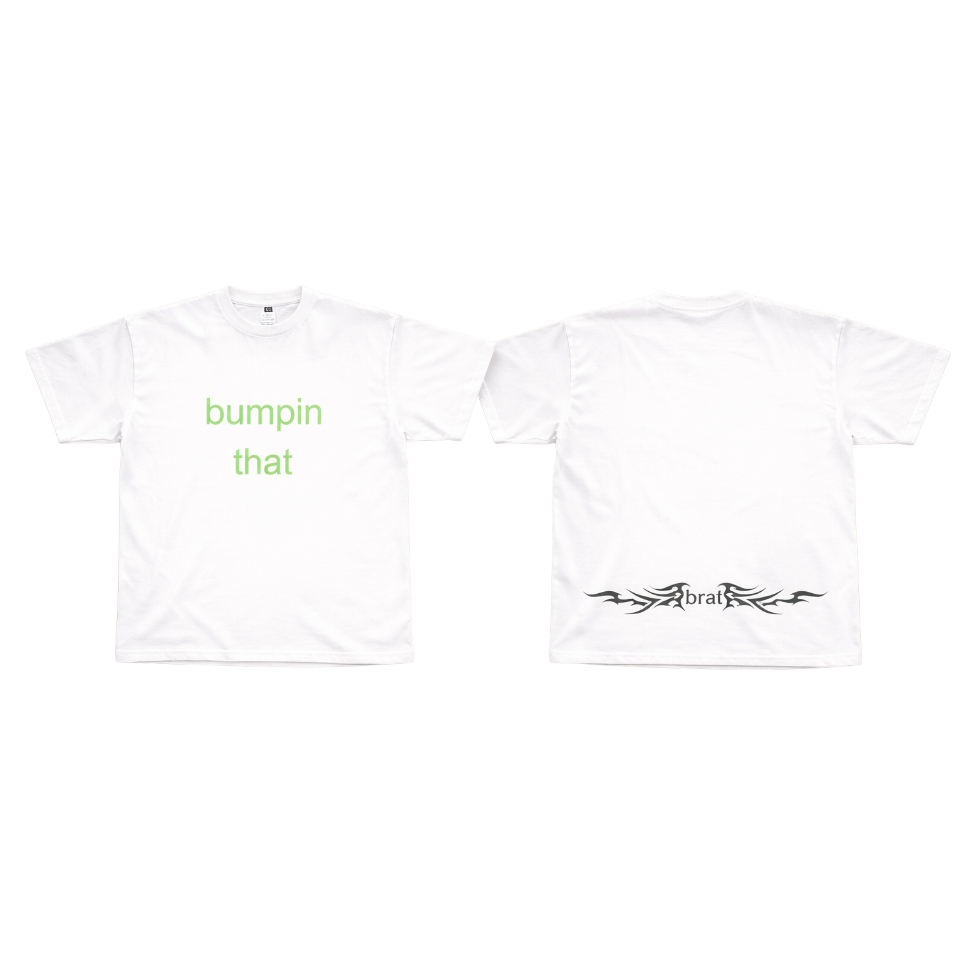
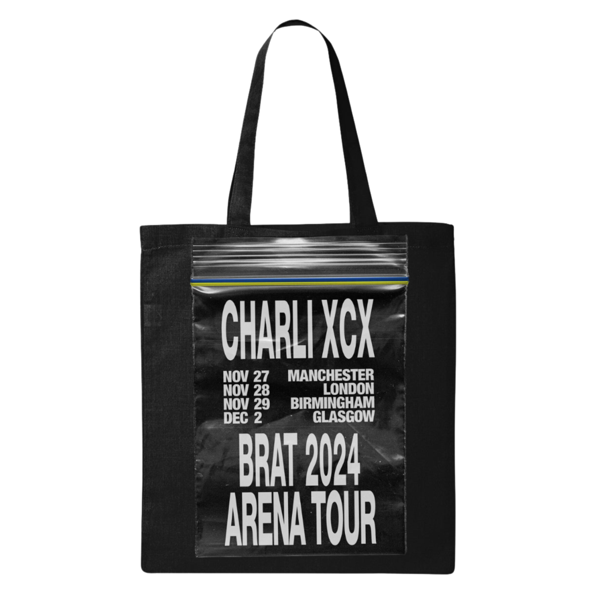
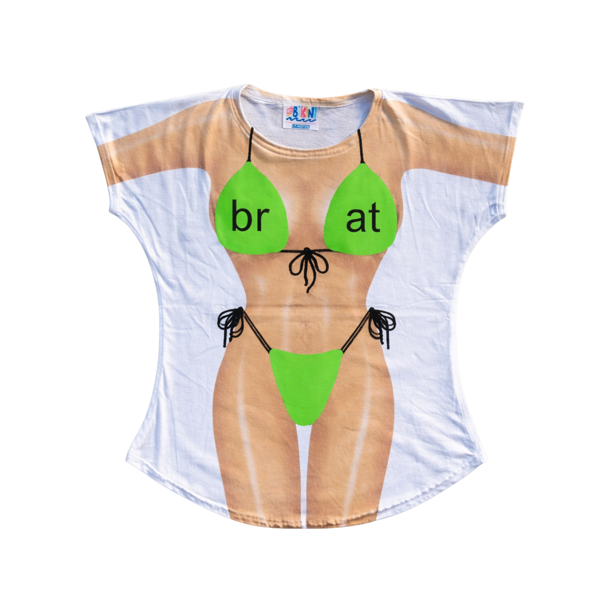
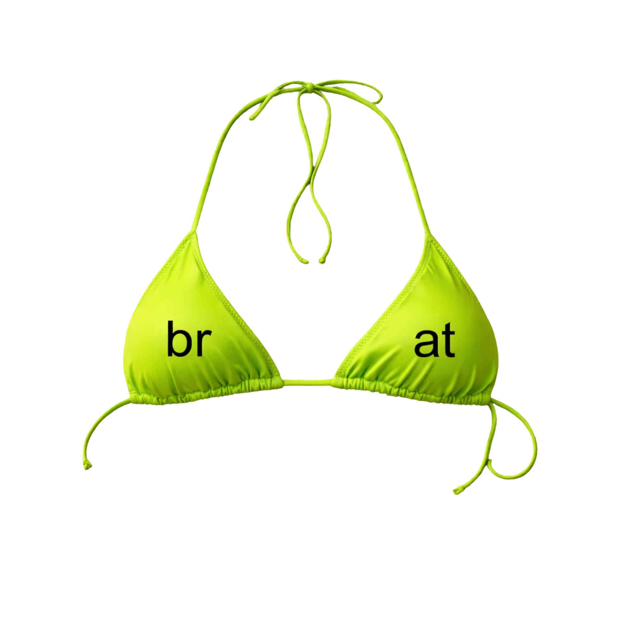
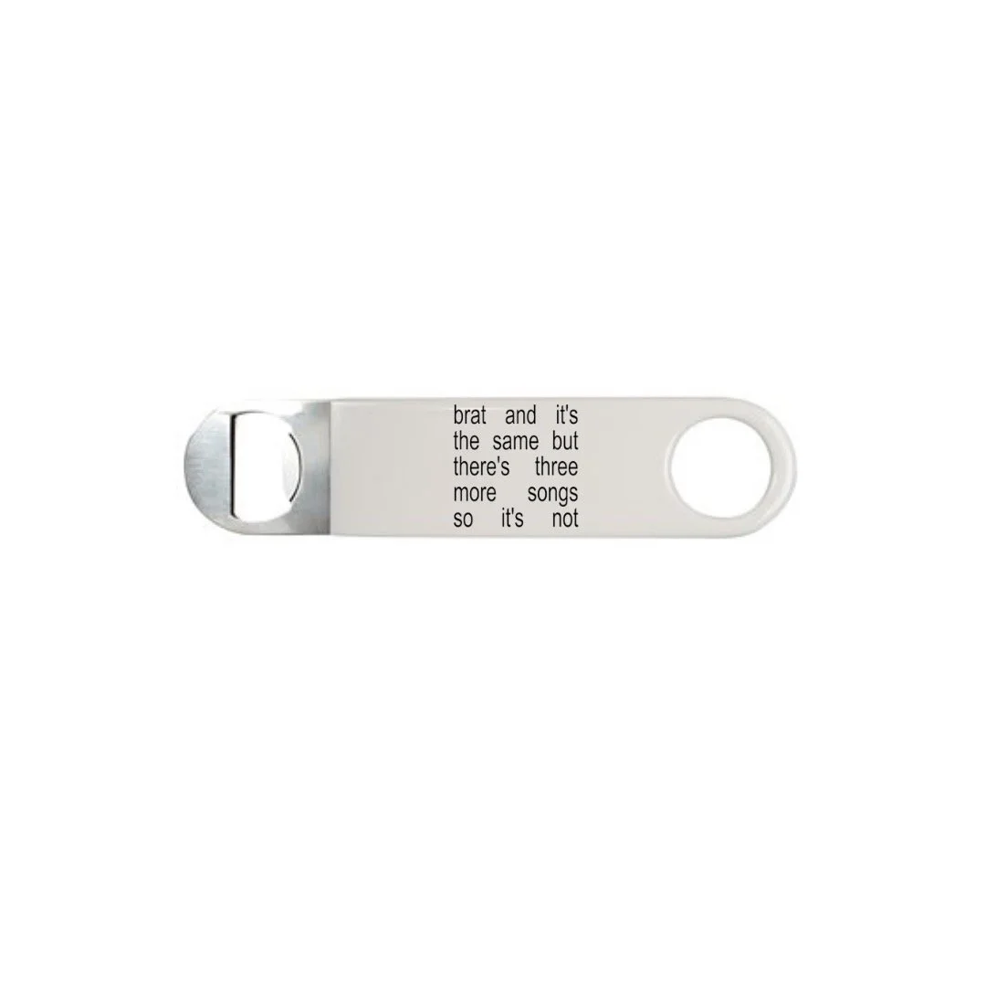
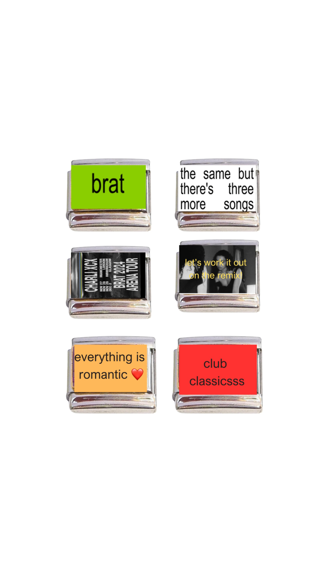
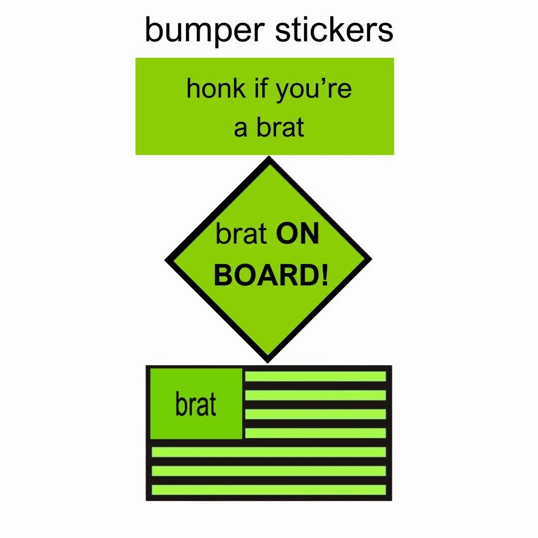
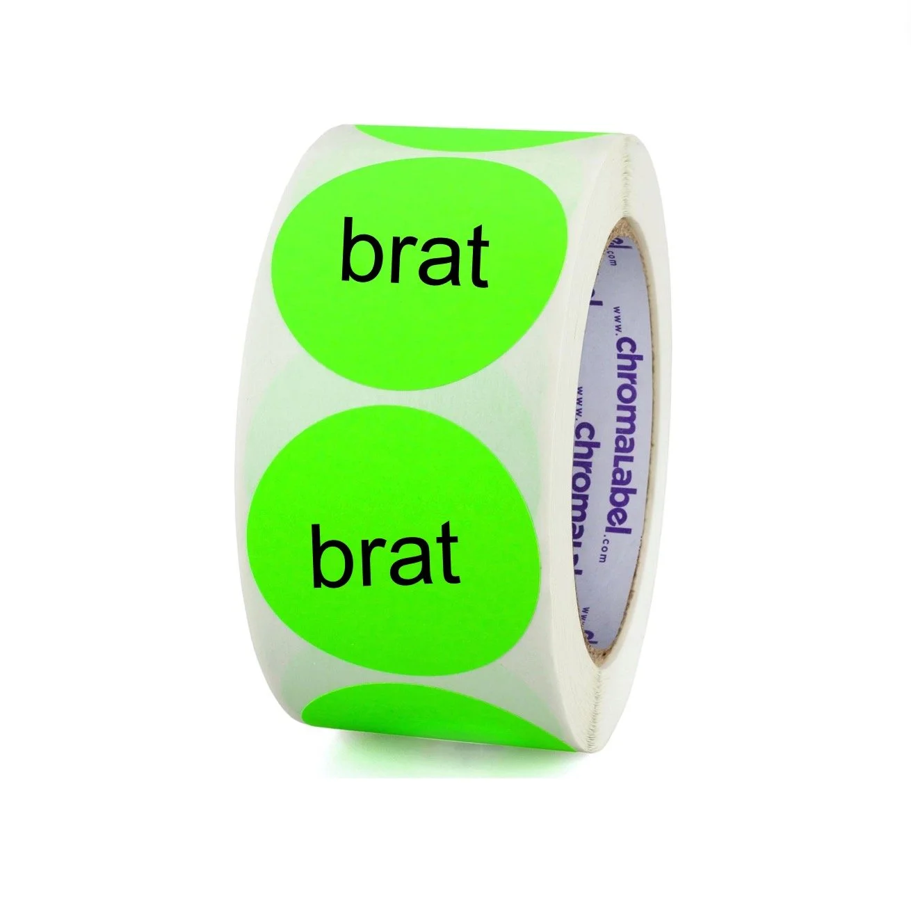
I wanted these designs and products to capture that exact energy. The merchandise feels playful, messy, ironic, and carefree — like souvenirs you would buy on vacation after a long night out. To materialize the distinct attitude of Brat Summer, I created merchandise concepts including temporary tattoos, bikinis, towels, stickers, hats, and graphic t-shirts with phrases like “I Survived Brat Summer and All I Got Was This Lousy T-Shirt” and “I Love Brat.”
The entire concept was meant to feel nostalgic, impulsive, and a little bit ridiculous in the best way possible — embodying the spirit of a summer where the only goal was to have fun.